# How do CSS Media Queries work?
CSS Media Queries[1] allow us to write some CSS that will only be applied under certain conditions, such as:
- Media features (screen size, orientation, etc)
- Media type (screen, print, etc)
The syntax is a little bit confusing, although there are plans to improve the syntax in the future[2].
For now though, this is how you do it:
.grid {
    display: grid;
    grid-template-columns: 300px 1fr;
    grid-template-areas:
        "header header"
        "sidebar content"
        ". footer";
}
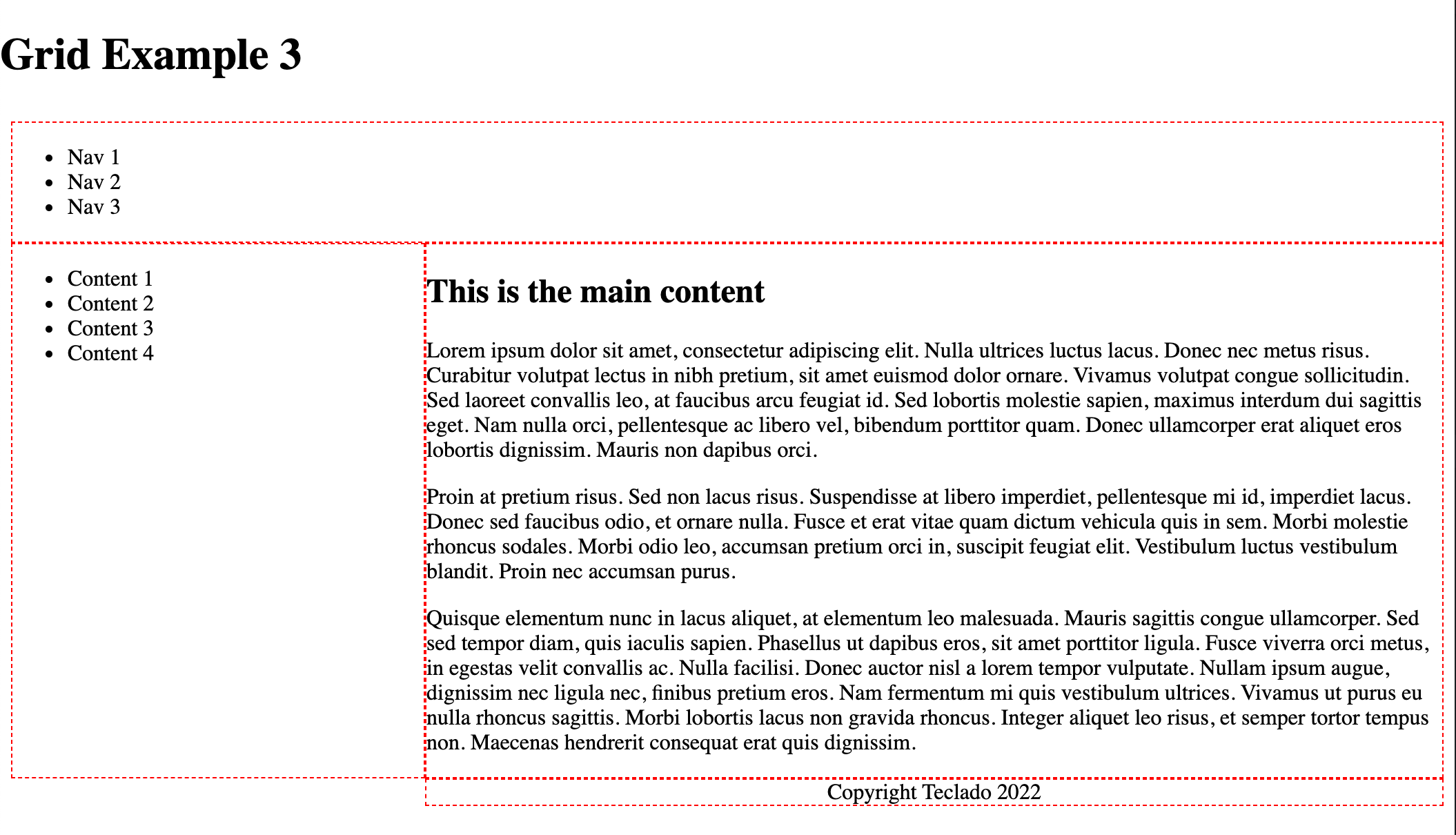
That would define a grid as we did in the last example of the previous lecture. It could look like this:
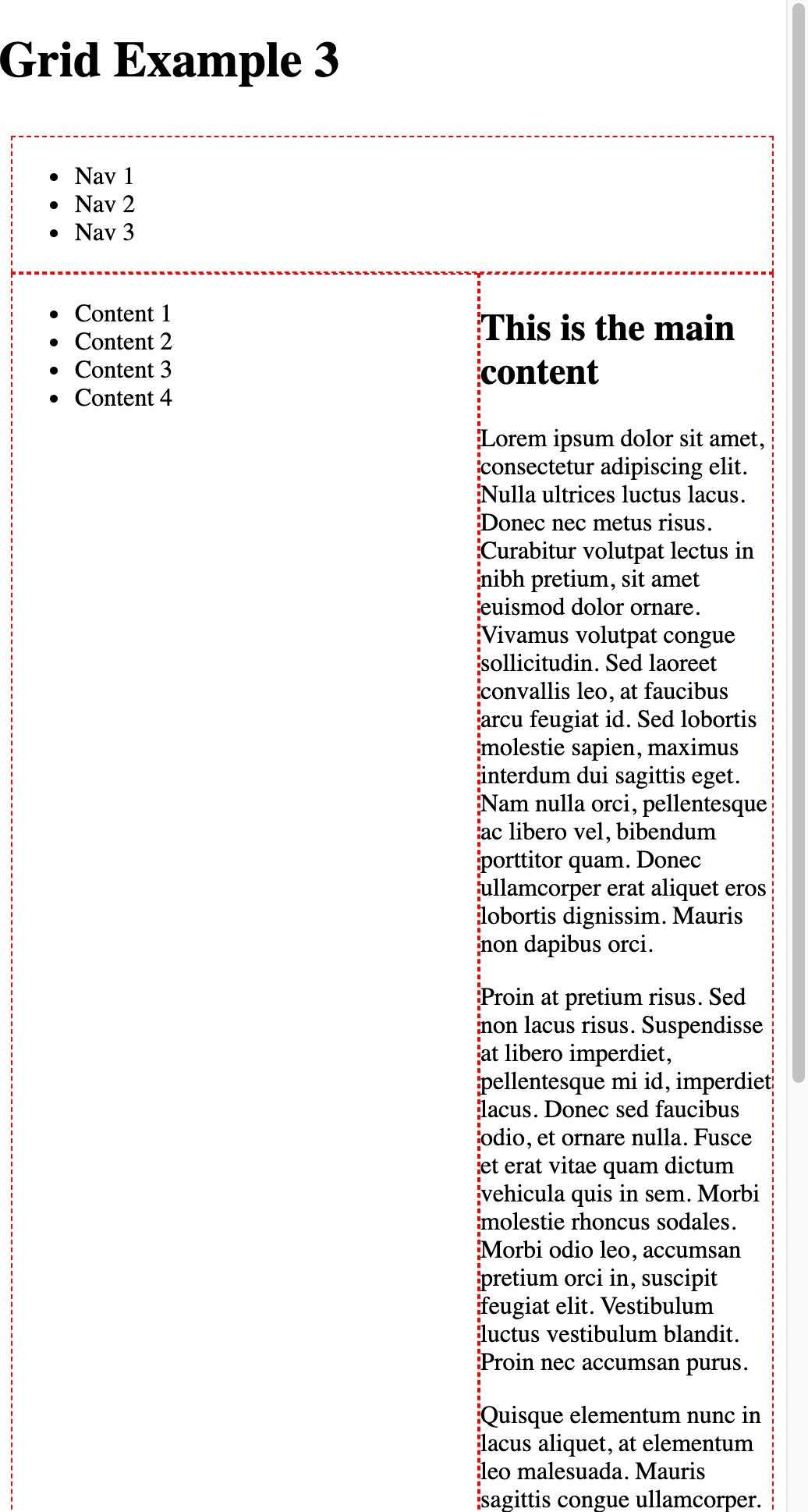
But when the screen gets smaller, you run into problems because the sidebar column is always 300px:
A frequently used option is to change things so the sidebar is above the content when the screen is very small. Here's how to do that using a media query:
.grid {
    display: grid;
    grid-template-columns: 300px 1fr;
    grid-template-areas:
        "header header"
        "sidebar content"
        ". footer";
}

@media (max-width: 720px) {
  .grid {
    grid-template-columns: 1fr;
    grid-template-areas:
      "header"
      "sidebar"
      "content"
      "footer";
  }
}
TIP
Inside a media query you don't have to change all properties. If untouched, properties remain as defined for the element outside the media query.
You can also define multiple media queries so that as the screen gets smaller, certain properties change.
TIP
It's also possible to go the other round and have the smallest-screen properties defined globally, and then use media queries as the screen size increases. We'll do this in the next project.
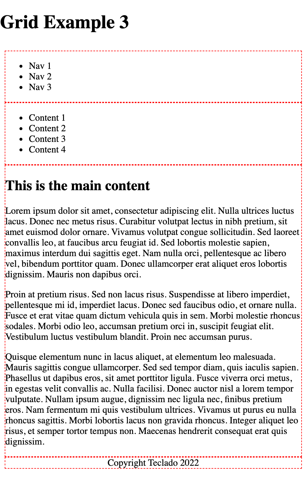
With this CSS change, we get what we wanted:
With media queries, CSS can get a bit bloated--because the same elements are targeted many times, once per media query.
That's why CSS also allows media queries when we define a link element to a CSS stylesheet:
<link href="global.css" rel="stylesheet">
<link href="mobile.css" rel="stylesheet" media="screen and (max-width: 600px)">
This would let you define a separate mobile.css file that is applied after global.css and can overwrite the CSS properties applied to any element while the width of the screen is less than 600px.
I don't use this feature often, because I quite like having related CSS selectors and properties together. I find it easier to see all the different changes that could be applied to an element, in a single file.
However if there are a lot of changes being applied, I will consider using this method so the CSS file doesn't get too long and difficult to read.